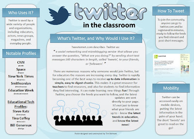
I decided to do my poster on Twitter. Although I personally have a love/hate relationship with it, I know that it has many benefits for the classroom. Here is how design theory played into the design of my poster:
Visual Literacy
I decided to have all of the images have some meaning tied to Twitter. The bird at the top is the logo, which is synonymous with the social networking site. The image in the center bottom is of people communicating which each other, which is the main goal of Twitter. Finally, on the right is a screen capture of an actual Twitter feed page, to see what the service looks like.
Technocentrism
I used many features of PowerPoint in my poster without it being overkill. The combination of images, boxes, and letters keeps it interesting without going overboard. I also used subtle effects such as shadows and transparency on the boxes that construct the layout.
Information Processing
My highlighting key words and phrases, I created chunks that are easy to store in memory, and also trigger similar experiences. I also tried to keep the information brief and manageable, and the colors uniform and simple to not distract from the purpose.
Cognitive Load
As stated in the previous section, I kept information brief to prevent overload of extraneous information.
Gestalt Principles
I used symmetry and similarity to make the poster easy to read and navigate.
Dual Coding and Mayer's Cognitive
By reiterating my points through both text and pictures, especially in the case of the illustration of people talking, it is easier for the reader to take in the information.
Excellent poster and description of how you addressed the theories we explored in class. Well done, Tim!
ReplyDelete